Spec. Copywriting Portfolio
View my Resume
Senior Gleaners
Type: Email Marketing
Description: A San Diego-based nonprofit organization named Senior Gleaners enlisted my help with email marketing.
The Senior Gleaners were running their email marketing using ConvertKit and sending out their quarterly email blasts in a format that made them less engaging than they could be.
The Approach: We started off by exploring a few other possible software providers to run their email marketing. To minimize complexity and maximize the organization’s budget, we eventually decided that reinventing the wheel was not necessary – and we stayed with ConvertKit.
After that, we examined how we could optimize this email marketing going forward.
I proposed a redesign to their template.
BEFORE:
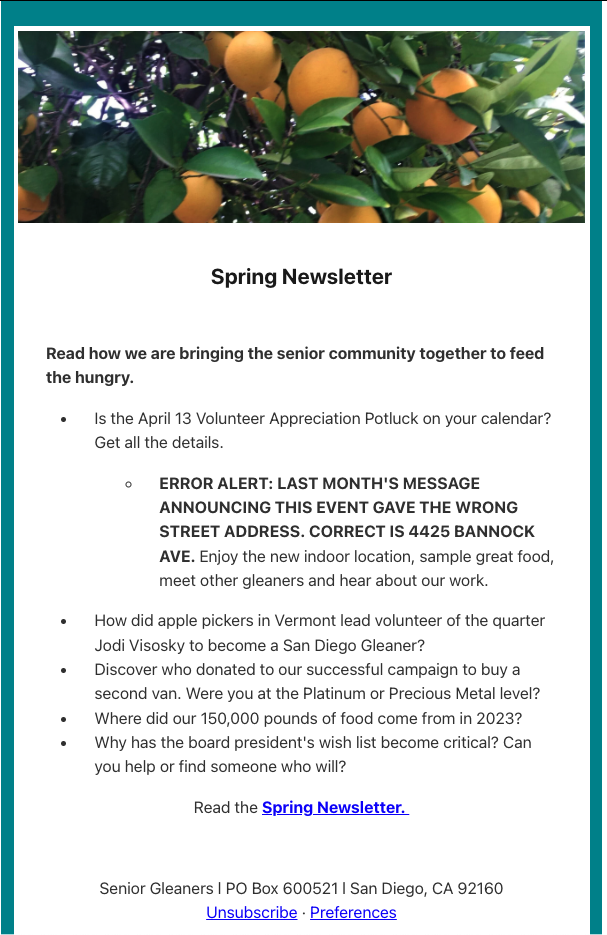
This format was text-heavy and difficult to digest. I also saw low engagement numbers with previous newsletters, and I knew that a cleaner, more engaging format had the potential to make the newsletter more delightful.
AFTER:
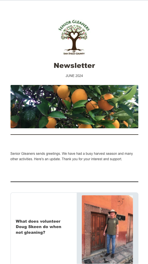
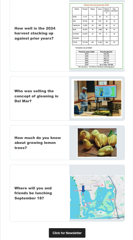
Instead of a continuous block of text with bullet points, we leveraged ConvertKit’s built in formatting templates to break up the newsletter sections into easily-digestible blocks showcasing each topic.
We also decided to include images to further boost engagement, offering a preview of what readers could expect in the newsletter.
Finally, we placed a clear call to action button at the end of the newsletter: “Click for Newsletter”.
The Results: The new formatting of the newsletter was effective in boosting engagement for the Senior Gleaner’s newsletter.
After the re-design, we saw:
- A 14.3% increase in the open rate
- A 6.9% increase in the click rate
- A 66% reduction in the total # of unsubscribes
This format was also easy to replicate for the organization. The template is now saved in ConvertKit and can be adapted for all of the future quarterly newsletters. Any new marketers within the Senior Gleaners can continue to send out newsletters using this format.
Shiny Dog Agency
Type: Social Media
Description: What do you do when you’re told to create an Instagram page for a company without a name? I quickly found out the answer to this question in my first job out of college.
I was working for Compadre which, at the time, didn’t yet have a name. Tasked with mocking up an Instagram page that showed what our future brand voice would be (once we had a name), I was keen for the challenge.
Enter: the shiny dog.
My coworker had the most adorable Jeff Koons inspired dog sitting on her desk. I asked if I could borrowed it for the afternoon.
And so, the Shiny Dog Branding Agency was born:
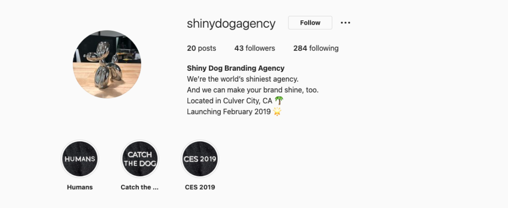
Beyond being just really freaking cute, the Shiny Dog Agency was a playful way to show what the vibe at our agency (the real one) was like.
In the days before reels, I primarily used the grid and stories for this account. I grabbed several photos of day-to-day office life, scenery, sunsets and our live-action shoots:
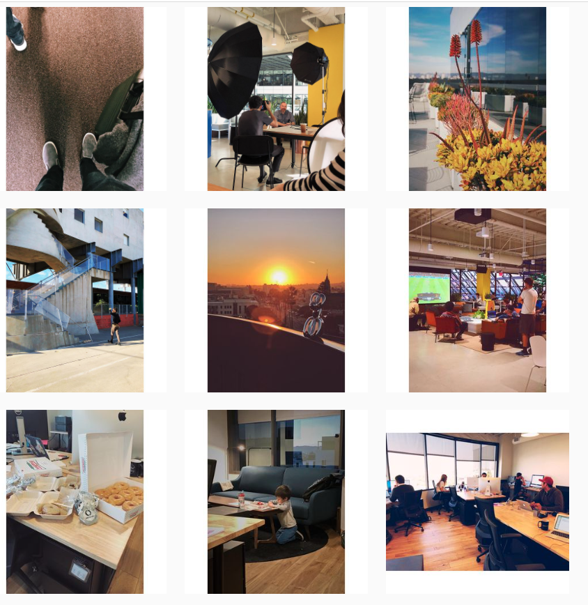
I also built in some graphics and, of course, many photos of everyone’s favorite shiny dog:
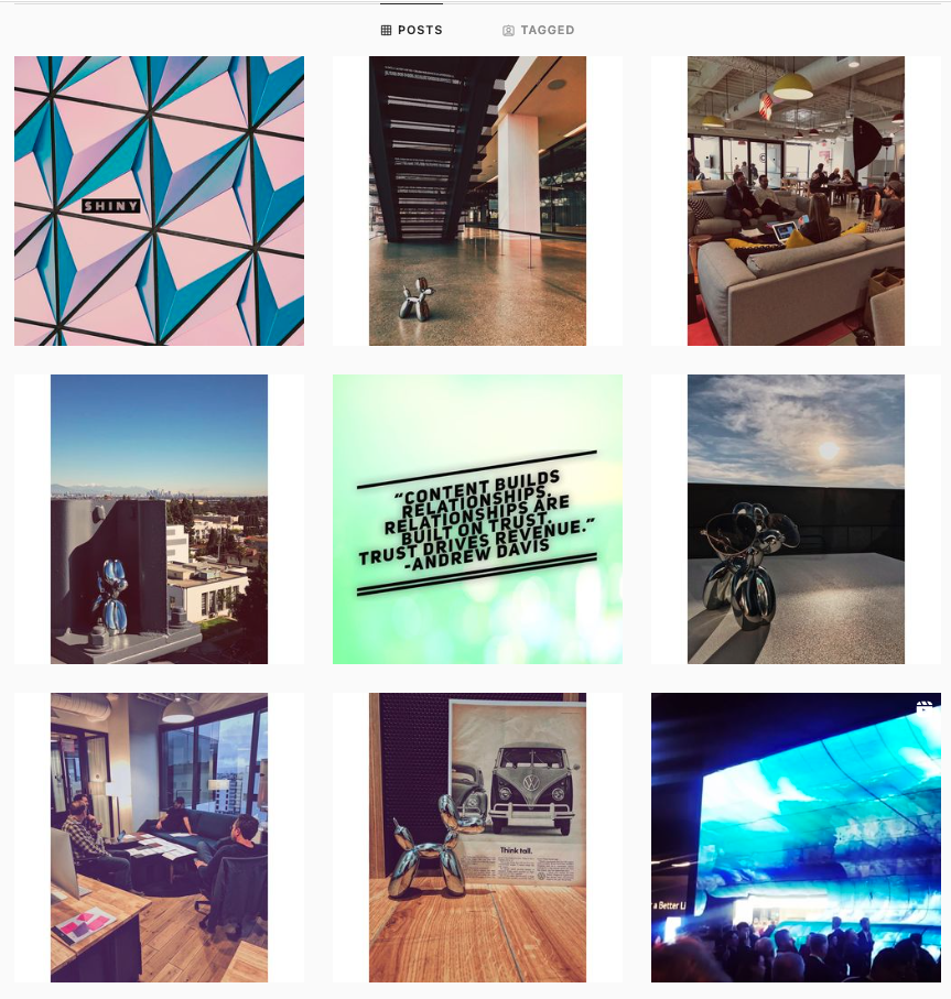
Overall, I was able to get pretty solid engagement for a marketing agency that, well, didn’t exist.
And the dog lives! The Instagram page is still live at https://www.instagram.com/shinydogagency/?hl=en if you’d like to check it out.
The Borgen Project
Type: Blogging / SEO
Description: I worked as a content marketing intern for The Borgen Project, a 501(c)(3) nonprofit organization focused on downsizing global poverty. During my time here, I produced weekly SEO-optimized blog posts that were published on The Borgen Project’s website.
Published Articles:
The UWM Post
Type: Long-Form
Description: I contributed to my college newspaper, the UWM Post, for a long-form piece. This was a comprehensive summary of the 2016 presidential debate. The piece examines the two candidates from an issue-focused approach.
Published Article: https://uwmpost.com/news/the-final-presidential-debate-of-2016-a-comprehensive-summary
Amtrak Mock Campaign
**Note: this is a mock campaign designed for learning purposes only. This work is purely my own; and is not presented on behalf of Amtrak or associated with Amtrak in any way.**
Type: Email marketing, branding
Description: As a lifelong train buff, I was recently inspired when I spent42 hours on a cross-country Amtrak train. I had a lot of time to contemplate Amtrak’s marketing in an ideal world.
Presented here is an ongoing marketing campaign for Amtrak. The goal is to provide creative ways to engage with Amtrak’s customers; and, in the process, showcase the unique benefits that only train travel can offer.
Selected Work:
Emails
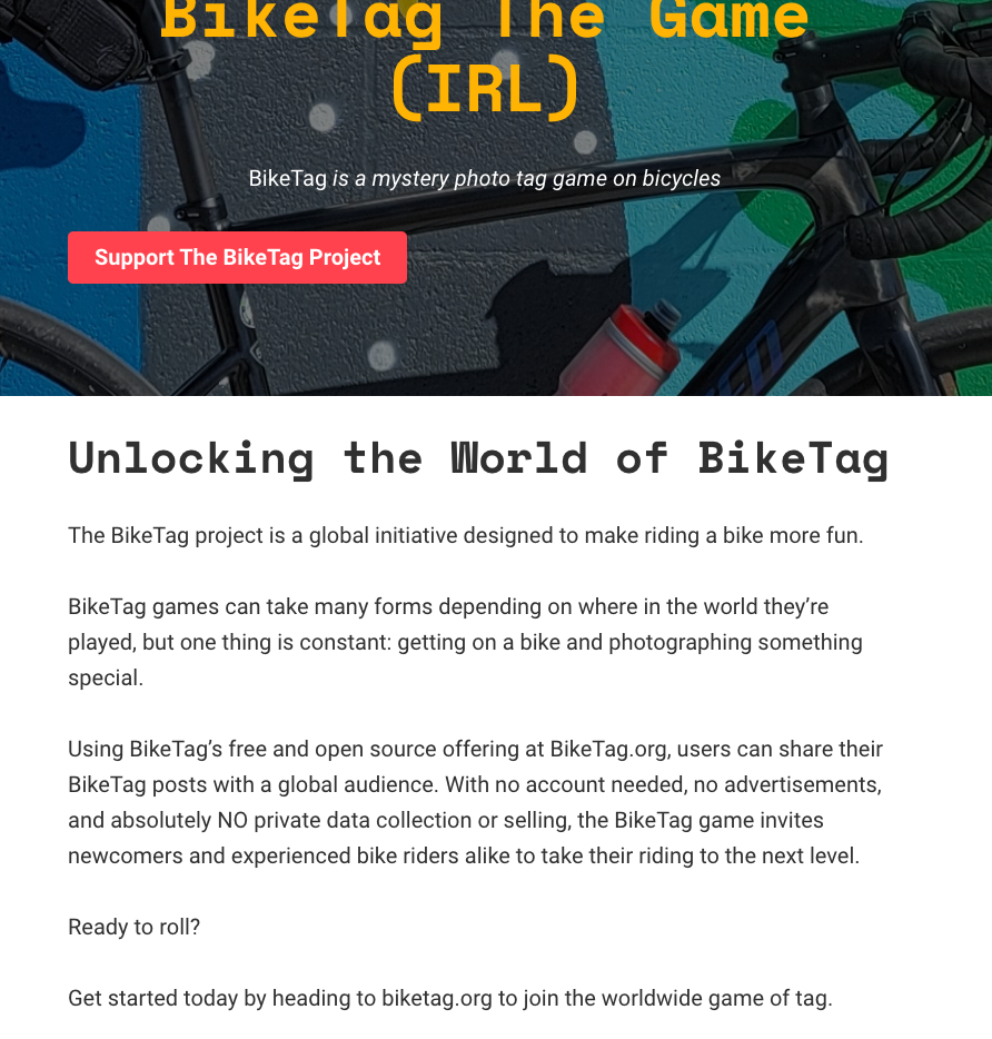
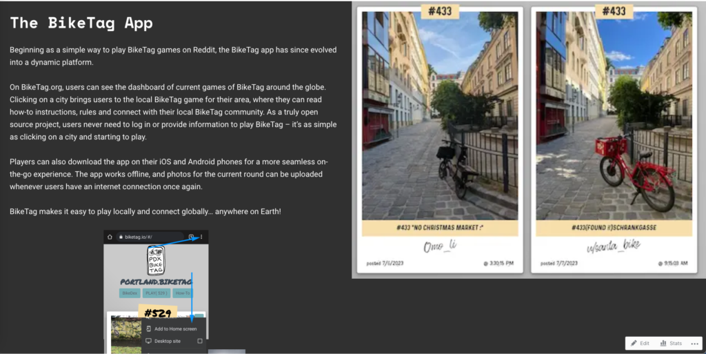
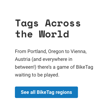
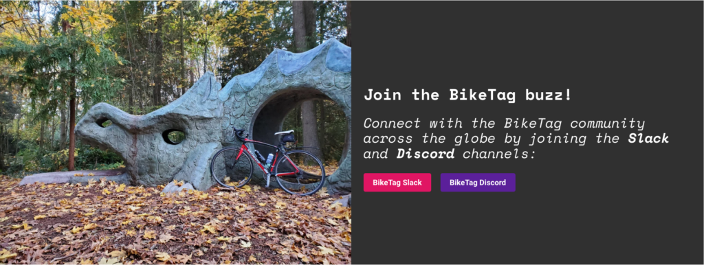
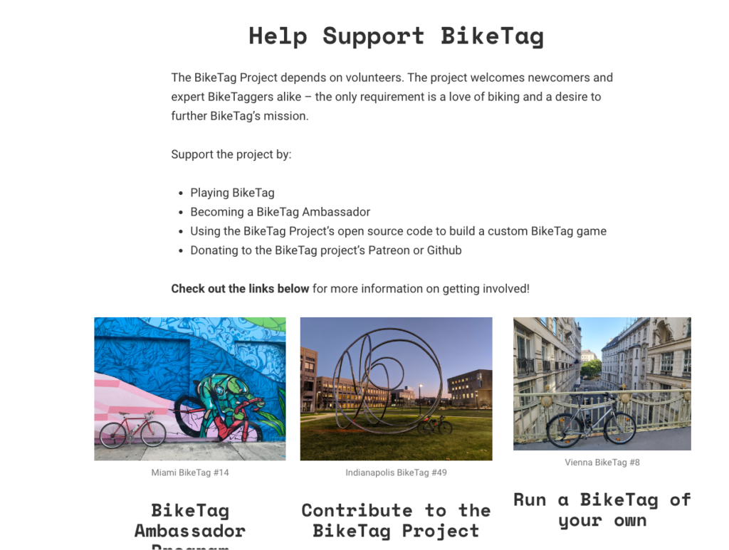
BikeTag Website Revamp
Role: Copywriter and Website Designer
Description: The Biketag.bike website was looking to refresh content and update images on their website. The previous content was clunky and lacked a call to action to encourage participation in the BikeTag game.
Solution: I began by making small updates to the timeline page for BikeTag by adding recently-created games of BikeTag along with images. I formatted the timeline in a way that was visually coherent with the existing timeline.
After the timeline updates, I began the larger lift of rewriting the Home Page content. Using a collaborative Google Docs document, I proposed revisions for each section of the Home Page and asked BikeTag to review the updates. This allowed for a collaborative workflow and a safeguard against publishing copy updates too early.
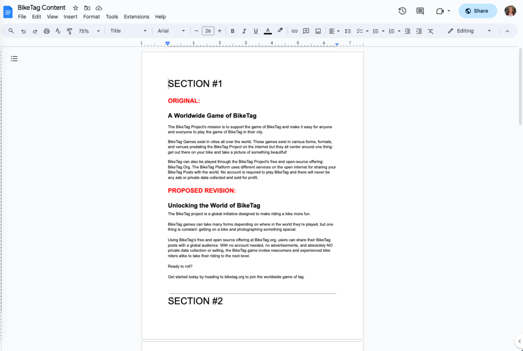
The focus of the rewrites was creating content that was seamless, engaging and provided a call to action. I wanted to be sure that the content was consistent with the BikeTag brand voice. Once the rewrites were approved, I replaced the existing website content with the new copy. I also made small image updates to the home page with new images from a more recent BikeTag game.
BEFORE:
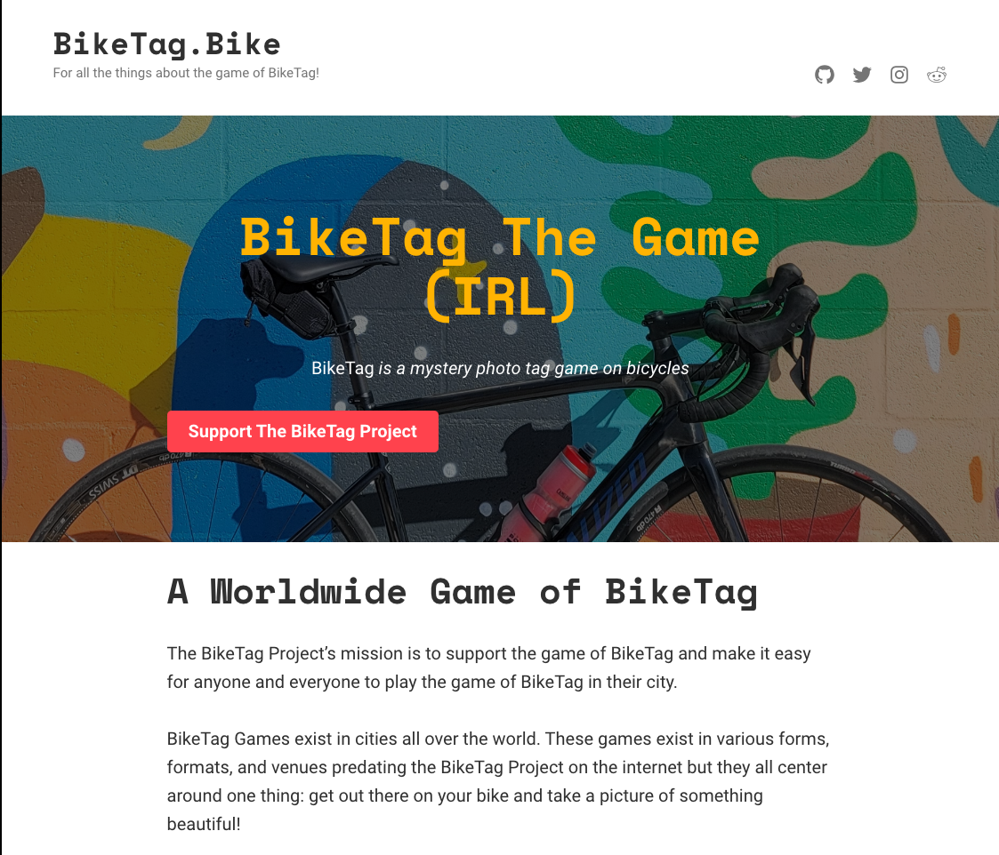
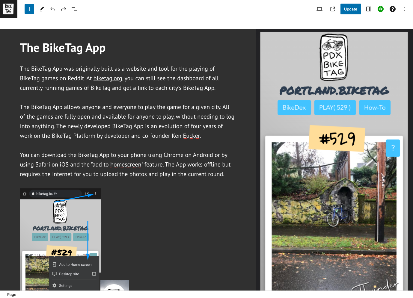

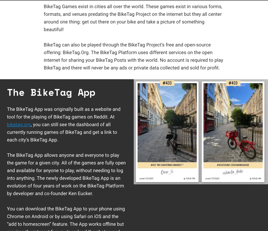
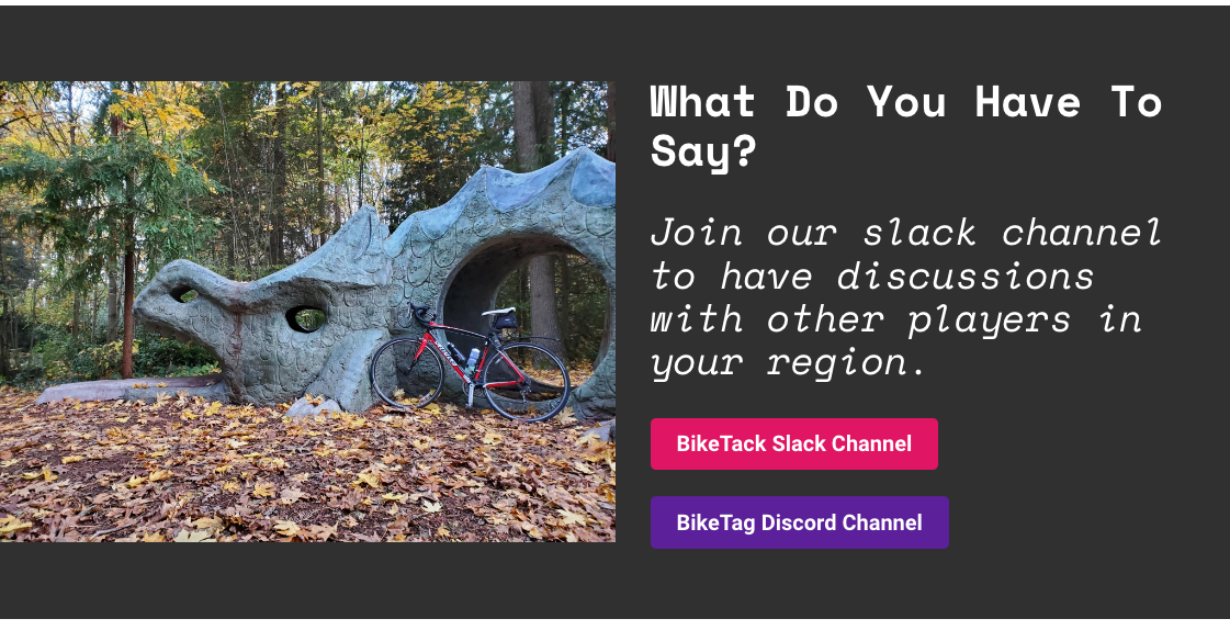
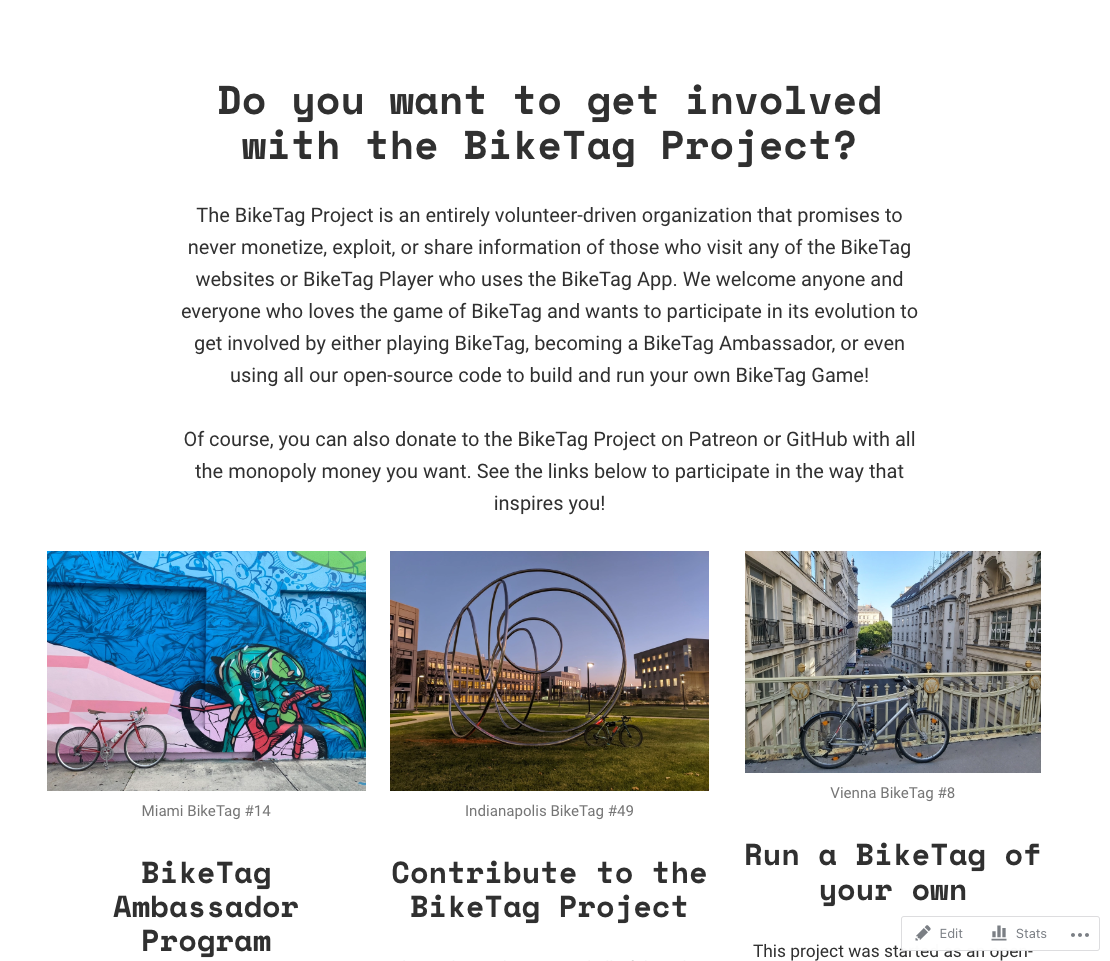
AFTER:
Speculative Copywriting Portfolio
The following are selections of work wrote “on spec”, and not for paid clients. This portfolio is meant to showcase my copywriting abilities through theoretical projects for some of my favorite brands.
They are not associated with, endorsed by, or officially part of the companies whose products they use, and I give full ownership of intellectual property to the brands.
Enjoy!
Jackery
I have admired the Jackery brand for a while. The products are built to last, and they enable outdoor enthusiasts like myself to take their exploring to the next level.
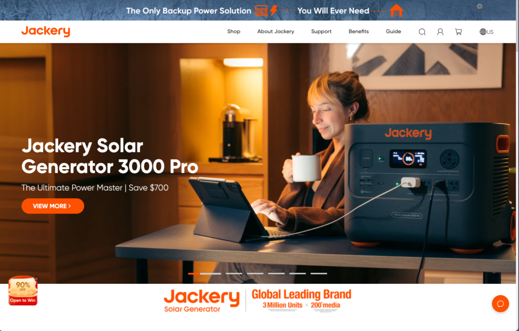
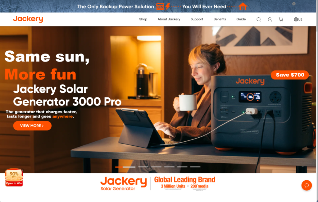
In this work, I provided a tagline to accompany a hero image on the Jackery website:
Same Sun, More Fun
I also added an additional line to convey the key benefits of the Solar Generator 3000 Pro:
The generator that charges faster, lasts longer and goes anywhere
Finally, I chose to maintain the $700 off messaging from the original, but move it away from the main text to prevent it from being text-heavy.
BEFORE:
AFTER:
MY RESUME